A fresh look that reflects our values, our history, and our evolution...
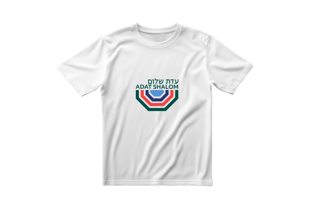
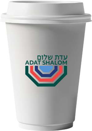
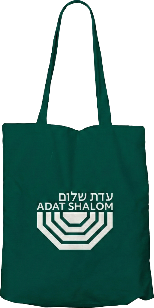
The logo is layered with meaning. It clearly evokes our sanctuary—the ceiling, the seating, and the bima—captured in a modern, abstract way. It reminds us of how we joyfully inhabit our sanctuary, dancing and linking arms. We use green most prominently because of our natural campus.
Our rebranding process launched with focus groups in early 2025, with members describing our community as a welcoming place filled with light, ruach, warmth, friendliness, music, multigenerational connection, and a deep connection to nature. One participant declared Adat Shalom as “the closest thing to sleepaway camp as a grown-up.”
Channeling that inspiration, we collaborated with the firm Gem Box Studio, engaging in months of experimentation and deliberation. We are thrilled and proud of the outcome. Our new visual identity is composed of rich, vibrant color; clean, legible lines; and both earthly and divine symbolism.